Flowcite Redesign or A Progressive Case Study
Read if you care
There is no better place on earth for UX designers. As I’m not from Mars, the rules did not change for me either. I started designing flowcite’s UX 4 years ago. I was so eager to impress stakeholders, the CEO and myself. I felt so confident. But did I succeed or lost in the echo? You are about to read a series of UX problems I faced and solved in this long term project. This is both a failure and success story.
Role-> Regret-> Less love for UX-> Goal
As part of the Design Team, I worked to create new user interfaces that would improve user experience as well as add value visually.
This project has been my responsibility since the beginning. Although it took almost four years to build, most of the research was done for the backend, which is actually in reverse. As this is a growing project, we were constantly adding new features. Having implemented all the expected features, now we can redesign it. The basic challenges are-
- Define missing UX Fundamentals
- Correct existing UX Issues
- Build a design System
- Continue to build new features.
Round 1
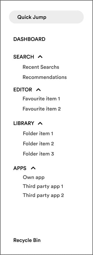
Left Side Navigation

Requirements
- Simple navigation
- Users should have easy access
- Users should quick jump to the recent items
- Should be collapsible if the user needs to see fewer items.
Nothing has gone wrong right? I mean this is a very simple navigation bar. Easy to navigate and meets all the basic requirements. Aha! The user must be very happy

“Headbang on the wall” — time
I missed some detailed thinking while I was designing and real users faced those issues too. let’s see what I missed -
- Only Search has two items to expand. Editor and Library can have multiple items. 1–100 or more if the user creates so. Even The Apps contain at least six items.
The problem created from this was ugly. There is a large scrollbar appears when the items grow large in the count. And suddenly the navigation turns good to access to impossible to access. How awful!
- Sometimes the collapse jump scares the users no matter how smooth the collapse transition was made.
- Too many left menu items push the Cognitive Load to the users.
Head Stitches and Applying Empathy
A small piece of satisfaction-

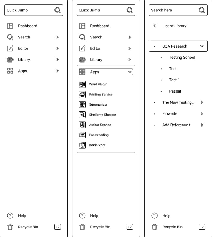
So we proposed a new navigation concept. We tried to solve the issues we found during the testing process (after 1 year of app beta launch!)
The new UX design ensures
- Less cognitive load
- Easier navigation
- Vertical collapsible feature for limited items which still don’t create any scrollbar
Critiques Quest
You still need to deal with the scrollbar right? On the 3rd screen?
- Yes, we do. But now users will know where they are and how to get back easily to the main nav (A sticky back navigation arrow on top) . The scroll collapse jump has been taken care of as well.
Did this new concept work out well?
- We are not 100% sure about that as this is a continuous process and we only get to know what users are performing during the test process. So this is not the best solution.
This is my first attempt on writing. I never wrote any blogs or case studies. I will continue this in future days. Please feel free to give suggestions, ideas as I’m new. Please support if you love this. thank you for reading this.